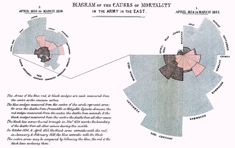
When Florence Nightingale used a Coxcomb diagram to present the case for improvement in military hospitals to Queen Victoria in the 19th century, little did she know that the diagram would not only form an important part of the history of hospitals, but also the history of visual representation.

Nightingale didn’t just want to present the facts about disease and mortality: her Coxcomb diagram maximises the emotional impact of those figures. As this early example reminds us, an ‘infographic’ isn’t just about compressing large amounts of information into an image. It’s really the art of telling a story by turning that data into a more subtle and persuasive visual narrative.
In the past two years infographics have grown more commonplace. With a number of free and easy-to-use tools available, infographics are proving popular with social media users. But there’s a real danger that some of the basic principles behind them are being forgotten. Especially in terms of learning, taking the decision to include an infographic is not about making a few numbers stand out with vector graphics, but instead offering learners a more dynamic and emotive pathway to connect with the content.
Firstly to refresh your interest, check out the striking work of David McCandless on the Information is Beautiful website and in his books. As any designer will tell you, don’t be fooled by the apparent simplicity of what you see. For McCandless, the physical image is the final process in the evaluation and conversion of a complex array of data into a narrative.
Now you’re feeling suitably inspired and ready to include an infographic in your own training material, it’s important to ask yourself three important questions before you begin:
- What is the purpose of the infographic?
- Why should it be important to the learner?
- How can we use it to explore the learning further?
And once you’ve answered those questions, it’s helpful to keep some key rules in mind:
- Try using complementary colours next to each other create a bold contrast. Remember that, with infographics, some the usual rules on colour palettes can be waived.
- Use as little text as possible, and definitely don’t try and convert whole sentences directly into vector graphics. Keep only headings and key words in the main diagram, and shift additional text to dedicated areas around the sides.
- Where possible, use custom illustrations. For example, when comparing the profit sheets of two organisations you may want to use two differently sized money bags to make a bigger impact.
- Above all, be understated. The point is to tell a story about information, so avoid the big reveal. If your infographic is making such an obvious point, you may not need one at all.
Of course, the next generation of interactive infographics has already arrived and some of the results are fascinating. Just look at the highly intuitive way the American Civil War is explored in this educational infographic. It will be interesting to see how we can utilise these new forms to create more interesting and immersive e-learning solutions.


