
We’ve talked a lot recently about the understated importance of user experience (UX) in learning, and how to improve it. But it’s not just learning or web design UX that are important to our everyday lives. In fact, the user experiences that have the biggest effect on us are physical user experiences.
What do I mean? Well, it’s any off-screen experience, from a trip to a shopping centre to navigating a hospital. Your commute, your grocery shopping, your evening meal at a restaurant… all of these are user experiences that have been designed, and so can be improved, as can our learning.
We’ve become so used to user experiences in the physical realm that most of the time we don’t even realise it’s there (unless of course, you’ve had the pleasure of riding the Northern Line at rush hour)! Indeed, sometimes the very best user experiences are so smooth we barely notice them at all. The same should hold true for learning! A great learning platform and content interactions should work behind the scenes to make the user experience – the learning journey – as effortless as possible.
Training on track
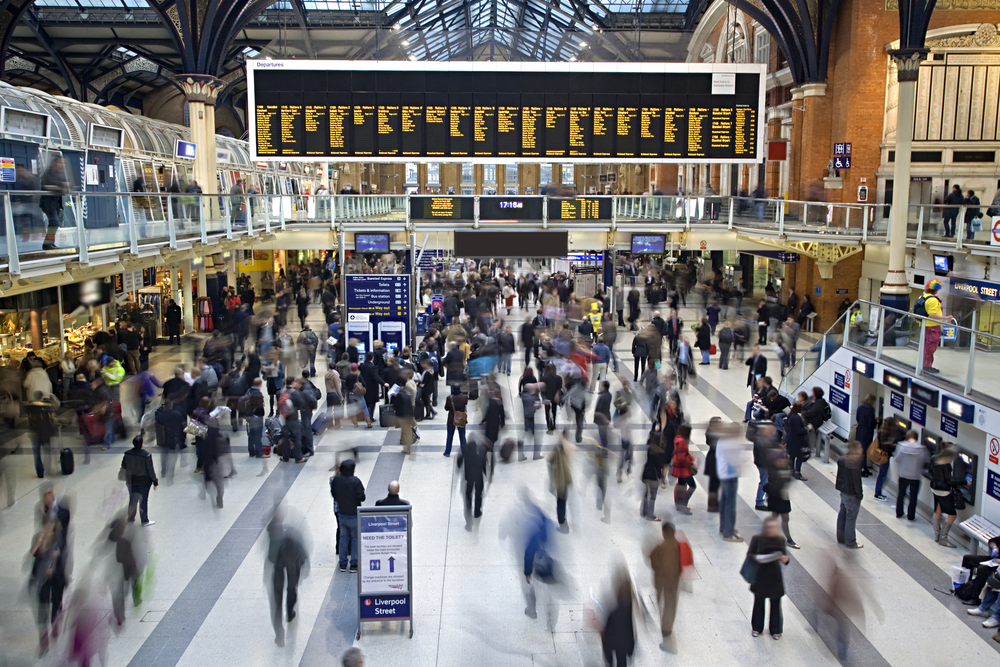
Let’s take a look at just how vital the user experience can be by considering it from the perspective of one of the highest concentrations of moving human traffic, the busiest station in the world. Can you guess which that would be?
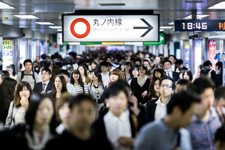
If you guessed somewhere in Tokyo, Japan, then you’d be right. Shinjuku, one of Tokyo’s many major transport hubs, accommodates around 3.6 million passengers every day, making it the busiest station in the world by volume. Despite the bustle, Shinjuku has a remarkably efficient user experience, and this all comes down to how the station is designed.
There are 20 platforms at Shinjuku, each dedicated to a sole service, eliminating the need to look at a departures board. No last-minute platform changes can cause confusion among travellers, and with no two services ever sharing a platform, the risk of a major disruption is minimised and delays are rare; vital in Japan where a train is considered late if it runs 30 seconds behind schedule. In fact, a late train is such a rarity that when one does occur, station employees often hand out special cards for workers to show their bosses so they believe it as an excuse for tardiness.
For the user, this simplification and separation mean that they only need to locate one platform, keeping the experience simple and clear. They’re given a clear track towards their goal and not confused by unnecessary variability. Learners like stability and clarity from their UX. The excitement comes when they board the train(ing)! (Too much?)
The user experience at Shinjuku station also has to take into account the huge variety of users, from the battle-hardened commuter to the socks-and-sandals tourist. The UX design must therefore strike a balance between sleek repeatable routes and presentation of information. The same balance must be struck by learning.
Overall, though, most users of the station are looking for the same thing, efficiency in being able to navigate quickly and spend as little time as possible in the station. The difference lies in how that goal is achieved.
Perth-onalisation
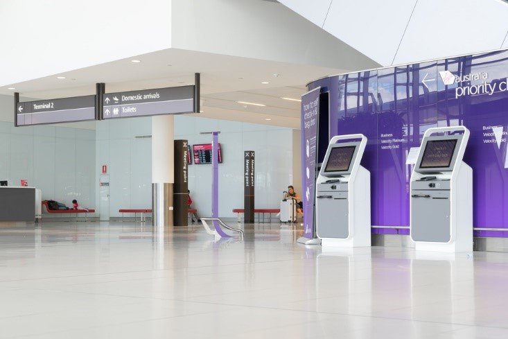
Another example can be found at Perth airport, Australia. In the building’s design phase, it was highlighted that users are often disorientated or have higher stress levels when travelling through an airport. So, systems were put into place to reduce that stress across the entire user experience.
Airport check-in and security queues are a large reason why airports can be stressful. At Perth airport, they have given control back to the user, since control reduces stress. They did this by adding reactive technology touchpoints throughout the journey to keep constant communication with the user. These touchpoints give the user a sense of agency, a vital element of full user engagement, and personalise the experience based on the user.
The delivery of the reactive touchpoints has been used as an extension of the airport’s wayfinding system. The touchpoints deliver information to the user by acting as a platform that they control. They can look up flight times, airport safety information, and any other airport information that is relevant to them. The touchpoints are placed in areas that have been known to cause higher stress levels, such as before security gates or in confusing spaces, ensuring that the next stage of the user journey is always available to them to find themselves, even if the information isn’t readily apparent.
Think about how this could be done in learning. Allowing learners to make their own choices of how the learner progresses through a course or giving them control of how they access materials in a platform. Signposts such as virtual mentors can give them clear directions and guidance, but if they can request assistance, then they are back in control of that advice. Anything that gives power back to the learner in their user experience is a positive.
Bridging the gap?
As technology continues to bridge the divide between real and virtual environments, it’s important to look at the structures that guide our daily experiences and incorporate good design accordingly. By doing so, we can ensure that our digital experiences continue to be realistic. Learning can feel more natural, allowing the user to be fully immersed and engaged with the content.
Perhaps the most important take away is that a seamless user journey allows an efficient, refreshing, and satisfying experience… as should all learning!