
Whether designing websites or learning experiences, one of the issues a developer needs to consider is accessibility. This means being able to design content that can be consumed by as large a target audience as possible, including those with any form of sensory impairment. A key feature that is often overlooked when striving for accessible design is colour selection, and how the eyes perceive these colours. This article will take a look at how to properly use accessible colour design whilst keeping your design vibrant.
Biological basics
In our eyes, there are two major sight-giving cells, rods and cones.
Rods are the cells responsible for allowing us to see in the dark. They can only see black and white, and with much less clarity. We’ve all noticed the drop in visual quality at night, right? Studies vary in the number of cells regarded to be present in the human eye, but the average is around 100-130 million.
Cones are the cells responsible for allowing us to perceive colour in high resolution, but they need bright light to do so. Cones average from 6-8 million per eye. In other words, we’re naturally colour deficient.
The chemistry of colour
So what triggers the eyes to know which cells to use? Well, they rely upon photopigments, sensitive light-reactive chemicals inside the rods and cones. For the rods, these photopigments are called Rhodopsin and they’re a lot more sensitive than the pigments in cones. Intense light can cause these pigments to decay reducing the sensitivity to dim light. That’s why getting used to the darkness takes a lot more time than reacclimatising to bright light. When you turn off the bedroom light and stub your toe, blame the Rhodopsin!
Different parts of the colour spectrum of light activate the rods in a different ways. For example:
- White activates the rods fully
- Red does not activate the rods at all
- Green activates the rods fully
- Blue activates the rods at about 80%
- Violet activates the rods at about 20-30%
Depending on lighting, blue can potentially become indistinguishable from other colours surrounding it. Blue can therefore be very hard to distinguish for older viewers or those with visual impairments. When aiming for accessible colours, try using only one blue hue to avoid confusion.
Designers and developers also need to be very careful how they pick and mix their colours. Red (#FF0000), Green (#00FF00), and Blue (#0000FF) trigger the respective cones, but different colours cause a different combination of these cones to activate. Most people have normal colour vision, called trichromatic, which is a fancy way of saying that they can see all three colours normally. However, roughly 8-10% of men and 0.5-1% of women suffer some kind colour vision deficiency, and can’t fully discern all colours in the right proportions.
Colour vision deficiency is more widely known as colour blindness, and the common understanding is that a colour blind person cannot view the same colour as others. But there are actually multiple colour vision deficiencies, from not being able to see the depth of red saturation to having a green weakness.
Developers often don’t know or forget about the difficulties users can have while viewing colours and don’t always consider what to do to make it easier.
Problems in the dark
When a user is viewing a website or any learning on a screen, their eyes are being filled with bright light. When the room around us is dark, however, this causes a discrepancy. The light hitting the centre of your eyes where you are focusing, triggers a chemical reaction in the rods’ photopigments to recognise it. There’s no reaction in the peripheral parts of the eyes, however, and this inconsistency can lead to a constant readjustment that can cause eye strain or headaches, particularly for those suffering visual impairment.
This is the reason that a lot of websites and software now offers dark modes or dark themes, and recently YouTube, Skype and others are testing dark modes in their beta versions.
How to design in accessible colour
So what should designers and developers positively do to make colours accessible?
- Try to use as many of the primary colours red, blue, and green as possible with strong contrast hues of each.
- Avoid combining combinations of colours that can cause confusion, such as:
- Green and Red
- Green and Brown
- Green and Blue
- Green and Black
- Red and Yellow
- Red and Orange
- Blue and Purple
- Try to use as few colours as possible whilst fitting in with your design. Don’t use too many hues, either, especially varieties of blue hues. Simplicity is the key!
- Create a Dark Mode theme or an option to dim the lights on your product.
To really bring home the issue, take a look at this representation of how colour blind people view things, using a chart from Ishihara test for colour blindness. It’s only a small portion of the test, but it can give you an idea of how problematic colours can be.
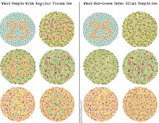
You can (hopefully) see that there’s a huge difference, and thus imagine the problems poor accessible colour design can cause for the visually impaired. Overall, one way of looking at the issue is that we are all naturally colour deficient. Good design is about recognising that and making designs that are both appealing and easy on the eye for everyone.