“To design is to communicate clearly by whatever means you can control or master.”
Milton Glaser
To turn a good design into a great one is not rocket science – you just have to think outside the box. The box I refer to here is a colossal text panel over a bland image – which is usually what elearning ends up looking like. But there are hundreds of ways to bring a new dimension to your design. Here’s six to try out:
1. Substitute large chunks of text for images that tell a story

Thinking visually, large chunks of text often look dull. Instead, try telling the story using a scrolling, parallax animation. Here’s an example that comes to mind.
2. Wrap text around your design

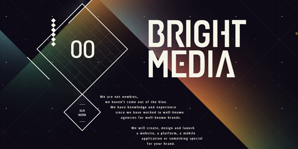
Interesting typography is a fundamental part of an attractive layout. Here’s an example of how we can align text with images to create a smart, dynamic feel.
3. Use empty space aesthetically

Don’t restrict yourself by thinking that white space needs to be white or empty. Sound City Project shows how to make the most of that empty space.
4. Play with letter spacing

Using letter spacing well can be a great way to align your text when it’s in blocks and create a warmer, more conversational feel at the same time.
5. Use padding

When using multiple elements within your layout, make sure they all have their own margins. Here’s an example of good padding.
6. Don’t bore with buttons – oversize your icons

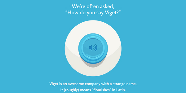
Finally, a clever trick is to increase the size of icons so they behave as a ‘call to action’ button, like over here at Say Viget.
To cap this list off, let me just say that, as important as it is to stick to the fundamentals of design, good graphic design is also about experimentation. The most important design hack for elearning is to challenge the rules every once in a while.


