Yes, you’ve read that correctly, we can make learning sensational! Although the LMS landscape has evolved considerably over the years, with the introduction of sleeker interfaces and innovative features, there are still systems out there holding out against the change. It’s more important than ever to have a modern and engaging user experience for your LMS. So, let me expand on my formula for making your learning sensational.
Rand Fishkin, founder at Moz, said “when creating content, be empathetic above all else. Try to live the lives of your audience.”
We have to create an experience for the learner that is simple but also truly exciting. It’s time to get rid of plain boxes filled with too much data! Our goal should be to streamline navigation, organise the content, cluster the relative actions and be minimalistic in approach. By applying simple UX design, we give learners the opportunity to tailor their learning journey to their needs and taste. In turn, this helps your platform achieve its purpose: boosting performance and getting the right knowledge into the right hands.
So, as a graphic designer, I would like to share a couple of tips that might help spice up your user experience and create sensational learning to boost your organisation’s performance!
-
The interface
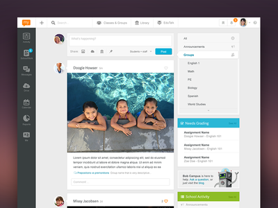
It’s definitely a good place to start, given that it is where the interaction between the user and the device happens. The interface needs to be designed in a way that makes the user’s interactions as simple and efficient as possible, for the user to effectively interact with it.
To make an interface that is simple yet elegant, and that adapts to all level of users, stick to the old adage, “less is more”. Colour, font and white space can inspire the mood of the learner, while a busy or cluttered layout on the other hand, may not engage them at all.
-
Dashboard
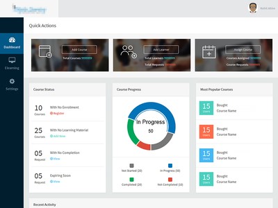
In a previous blog, my colleague Toby Harris explained that dashboards are a way to organise lists of tasks for the LMS user. We all know how tedious a list of tasks can seem, so being able to grasp at a glance the progress of these different tasks, or their progress in a learning programme, can only improve the user experience and retain your learners’ engagement!
The Cambridge Handbook of Multimedia Learning states that people learn better from a blend of text and images rather than from a text alone. Make sure your LMS dashboard reflects that blend! Instead of showing progress based only on text, try adding a progress wheel: it’ll bring a nice visual uplift.
As explained at the beginning of this point, dashboards are designed to help organise a list of tasks. My advice to you is: always remember that dashboards should be de-cluttered with only essential and important elements that cater to the needs of the learner.
-
Personalisation
LMS users are no different from any ordinary digital consumer. They want, and should get, a personalised user experience from their LMS. As the learner’s personal level of digital engagement increases, so does their willingness to interact with a learning environment that meets their needs.
A good tip here would be to introduce a tab which relates to trending topics or course content (like playlists), it will help learners to quickly see what people around them are up to and help them prioritise the different options they are given.
You might want to read our blogs on personalisation, where my colleagues have stressed how personalisation has taken over standardisation. Your LMS should try to reflect this growing trend and create a tailored experienced for learners.
-
Gamification
Here at Saffron, gamification is at the heart of all of our solutions, putting us on the list of Top 20 Gamification Companies for two years in a row. So I couldn’t write a blog on sensational user experience in LMS without covering this hot topic.
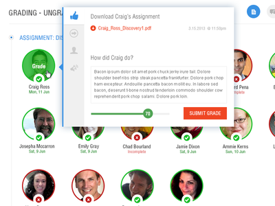
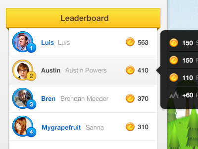
If you choose to gamify your LMS, you might want to consider adding a leader board. I know it’s a bit of an over-used term but leader boards make for great eye candy – especially when there are custom badges instead of simple stars or coins.
It’s also an easy way to kindle the inner competitiveness of learners, and highlights the link between using the learning platform and how they are performing. After all, working life revolves around competition and getting ahead!
To make your leader-board or points-scoring more meaningful, why not consider adding perks that can be ‘purchased’ with points? You could also have custom titles/profiles/achievements that are unlockable by scoring highly or occupying a high position on the leader-board. These could even translate into real-life competitions, adding tangible value to the gamification element of your LMS and engaging learners even further.
These are just some ideas to create a great user-experience and reach the hearts and minds of your learners. By doing so you will keep them engaged and enable them to perform better, which, at the end of the day, will help drive your organisation’s performance.
Want more useful tips to keep your LMS users engaged, and generate ROI? Make sure you join Saffron Interactive at the Learning Technologies show on 3-4 February at Kensington Olympia, London, stand E13. Toby Harris, platforms product manager, and Alastair Maclean, head of design and development will be delivering a key seminar for exhibition attendees: “Exploding the myth of ‘one best way’ and using playlists to deliver personalised learning that improves performance”.
Get in touch now to meet us there!


