“The utmost thing is the user experience, to have the most useful experience.”
Marissa Mayer
Slick interactions create a more dynamic elearning course that responds to the user and allows the user to really play and interact with your content instead of just looking at it. HTML5 has come a long way from its predecessors, and with the JS libraries which are currently available it’s time for us to push it to the next level! Below are six ways you can start exploring the full potential of HTML5.
1. SVG – Scalable Vector Graphics
SVG files are completely scalable to any size without quality loss, unlike PNG, JPEG or GIF files. SVG files will also be much smaller in file size generally. We can control graphics and elements within the SVG file using technologies like CSS and JavaScript.
In this cool example they show how to create an interactive infographic with SVG and CSS. This experiment with motion blur effect shows that there are plenty of ways we can bring life into animations with an SVG object.
2. Vibrant hover effects

Hover effects are always fun. This example shows you how to create a subtle and stylish effect using css transitions. And simply showing an underline for a link is old-fashioned – we should try something like this to be more playful.
3. Transitions for call to action buttons
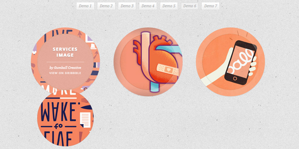
It’s nice to have an effect like this over a button with an icon, which describes your next activity. We can reveal a tip for the activity or a piece of trivia once you hover over the button.
4. Animated Menus

I feel claustrophobic when I see a busy menu. It’s better to hide all the menu items inside the menu icon and reveal them once clicked. This gives us the entire canvas for displaying the on-screen content.
5. Nifty pop-ups
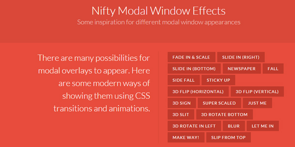
Pop-ups are under-rated and actually they can be very powerful in HTML elearning. Even minimal ‘tweening’ will refresh your pop-up. The examples here show how we can reveal pop-ups in a very attractive way.
6. Make your transitions rock!!
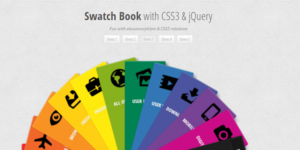
Whilst a simple animation (a transition using tweening) often makes the interaction look livelier, there are three basic things I would like you to rethink:
- Be mischievous with preloaders – users have had enough of progress bars
- Enhance text input interactions and checkboxes
- Click to reveal doesn’t mean that it has to be a circle with feedback afterwards…
As all my links show, there are plenty of JS libraries you can refer to if you want to start creating more incredible HTML5 interactions. But remember, it’s important for us to ensure that any effects we introduce remain compatible with older browsers by degrading in an acceptable way. Did someone say Internet Explorer 8…

