
Imagine, you’re in an airport and your flight has been delayed for a few hours. You walk around the terminal, go shopping, use the washrooms, get something to eat. You’ve managed to navigate a strange environment and find out all the details about your flight without having to talk to anyone. Who’s helped you out? How have you been able to do this?
Often, we don’t think about icons or signs, but the truth is that they are a silent friend – always helping us to communicate or achieve a goal. Often, they’re taken for granted, but icons are always there to guide us in our day to day life whenever we need them, whether we realise it or not.
But what makes a great icon? Well, it’s not just as simple as scaling down your logo to fit on a screen or sign. The best icons manage to combine simplicity with a clear brand identity and, in the case of an app, an understanding of the app’s functionality. Graphic designer Susan Kare has designed some of today’s most notable icons, including developing the famous Apple symbol. She says that:
“Good icons should be more like road signs than illustrations, easily comprehensible, and not cluttered with extraneous detail”.
Icons shouldn’t provide content themselves, but direct the user towards it. Moreover, it needs to be universally understood. Whether you’re creating an elearning course or a learning app, this universal appeal is vital and highly valuable in today’s globalised market.
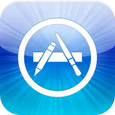
Take, for example, the immensely popular App Store icon. It’s instantly recognisable and makes the content that will follow clear to users.
Similarly, below are Saffron’s icons for content, platform and consultancy services. Their effectiveness once again lies in their clarity and simplicity. Despite the radically different colours, their simplicity of design guarantees a sense of continuity. Moreover, the lack of text is also the mark of a successful icon; it is self-explanatory.
![]()
If you take a look at your smartphone screen you’ll realise that these icons are the portals to a massive amount of information. Icons are able to break this down in to a manageable size.
So here are a few questions to ask yourself to ensure that your icon stands out in the crowd:
- Make sure you haven’t squeezed in too much information – the content comes after the icon, not with it!
- Will everyone be able to understand what it is?
- Does it represent your brand adequately?
- Make sure your design is dramatically different from other popular apps. You want to get noticed
- Will people remember it?