Looking back at the changes in design can be as painful as looking through your old wardrobe. Just like the questionable fashion choices of our past, some design trends are just a product of their period.
Don’t follow trends just for the sake of it! They may well have been popular techniques for good reason, but make sure it’s in your learners’ interest. I have listed 8 trends I hope not to visit again (optimistically)!
-
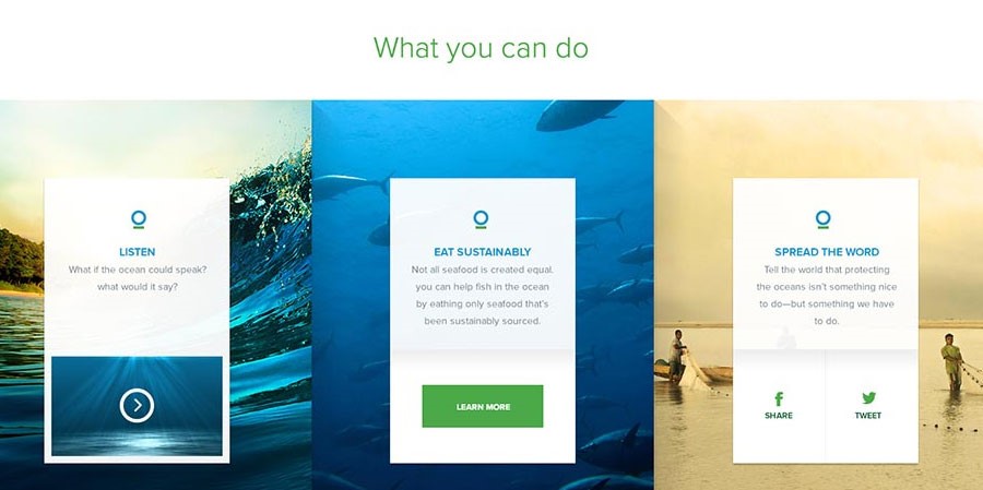
Fullscreen images
As much as fullscreen images add visual interest, they also adversely affect the performance and run time of a course. Overuse means lots of images which can increase loading times. A more efficient way of limiting download times is to bleed out the images plausibly.
-
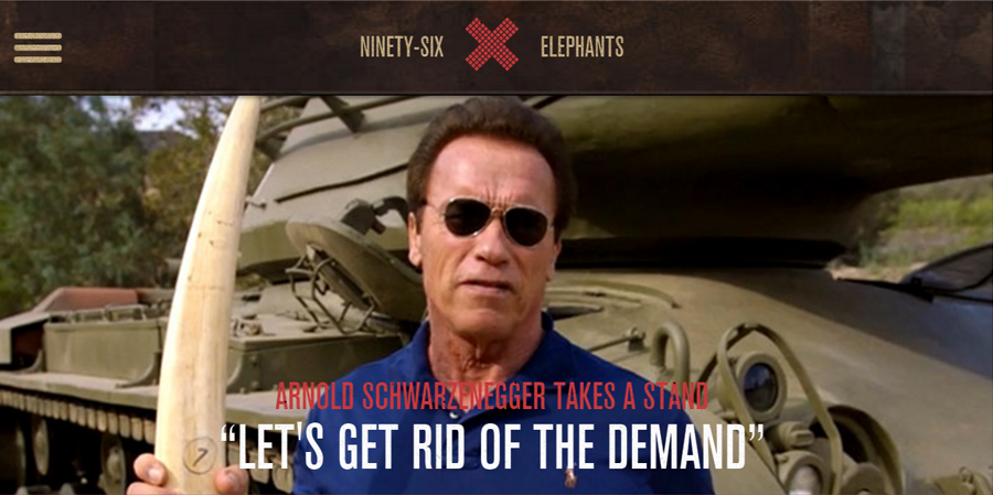
Claustrophobic navigation bar
It’s understandable that you want your learner to have the freedom of navigating around a course and accessing different resources. But you don’t need to have them visible at all times. Try to hide them inside a hamburger menu for a sleeker look. Regardless of devices or canvas size, this will save some real estate which you can use for your content.
-
Parallax scrolling
Usability Studies carried out research on parallax which found that whilst a parallax site was considered to be more fun, some users experienced motion sickness and experienced significant usability issues when interacting with the parallax content. Due to the use of images and JavaScript, a page like this can load slowly and can be a headache for mobile users. However, given that parallax scrolling can add another dimension to an interaction and allow it to stand out, you can try using vector based objects for simulating a parallax effect and convert the graphic into SVG, as the file size is quite small.

-
Ornamental typography
Too many typefaces create a confusing and disorderly looking layout. Experimenting with font is fine as long as you consider the need for a clean and crisp presentation. Stick to fonts and typefaces that complement each other or are different enough to provide an interesting contrast.
-
Giving up on animation
When we had the power of Flash animation we created eye-candy animations by introducing characters and typography. But with HTML5 we’ve gone soft and taken an approach which is subtle or mechanical without experimenting mostly due to browser limitations. I would suggest breaking through this by using SVG animation. Look at this technique introduced and explained by Jake Archibald in his article animated line drawing in SVG and also explored by Brian Suda in his article animating Vectors with SVG for 24Ways.

-
Generic illustration
After years of choosing from overused stock illustrations and limited web fonts, designers now should try creating custom illustrations. The inspiration are all over dribble. Illustrations are often quite colourful and can help you take advantage of the big, bright colour trend. This will add variety, and let’s face it, no designer wants their work to look generic!
-
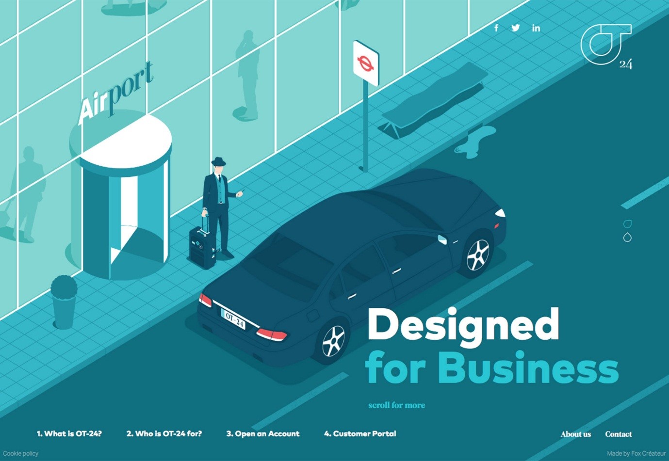
Flat design
As we moved from skeuomorphic design we should start breathing new life in flat designs by using shadow and depth to create visuals that appear dynamic! We can take a cue from material design on how to achieve this.
-
Overlapping
I don’t have anything against experimenting…it just looks awful if we overdo it! Think about text on an image, which is then placed on a shape, which is placed on an image, which is finally placed on a patterned background with an odd colour palette – utter disarray. Try to keep it simple, understand content is king and embrace minimalism by cutting down on the number of elements in order to create a fresh, uncluttered experience.