Imagine a world in black and white. While it might appeal to some, it definitely doesn’t sound too exciting to most of us. And that’s because colour plays an important part in our lives. Every colour has something to say; your brain reacts differently to different colours. Colours create ambience, catch and maintain our attention and stimulate us.
Here’s a question for you: what kind of customer base do you think a company whose website uses predominantly pink colours has? Are they targeting male teens, young women or male senior citizens? My money’s on young women. And though it isn’t always the case, the cultural associations with the colour pink tend to classify it as a quintessentially feminine choice.
So, when designing a user interface design for an e-learning course, I like to start with the client’s customer base. I look up the demographics of its customers and use that as a starting point to shortlist some colours.

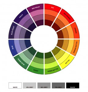
The next step I take is to refer to the client’s websites, print materials and any other resources that showcase their brand. You don’t want to re-invent the wheel… a client with an existing customer base will more than likely want to use and develop their existing branding rather than changing it completely. So, a design needs to be created that harmoniously blends existing colours (the client’s brand colours) with new ones (the colours used in the e-learning to engage the learner). A well thought-out combination can add that ‘wow’ factor in the design and complement the instructional design approach. You can use a colour wheel to help you choose complementary colours, or to determine whether you should use warm colours (red, yellow, orange shades), or cool colours (green and blue shades).
Having determined the colours, it’s important that we use them in a consistent manner; if you decide on green as your choice of colour for instruction text, then don’t use it for any other on screen elements. A good way to manage your use of colour is to categorise text elements into four basic types: headings, body or copy, learner instructions and links. Then decide on a colour for each type… and stick with it!
Bear in mind that some colours have taken on an almost universal significance thanks to how they have been used over a period of time. For example, a learner sees blue text which is underlined and will assume that it’s a link. Similarly, using green crosses and red ticks in feedback will leave your learners completely befuddled!

If you’re just starting out – maybe you’re developing your own e-learning using rapid tools – there are plenty of useful online resources and references that can help you. Here are a few of my favourites:
Lastly, tailor your colour choices depending on the learning solution that you’re working with. You don’t want to detract from video scenarios by providing a gaudy and potentially distracting background, nor do you want to use a lurid green as your core colour across every element of a 12 hour solution. It’s important that the colours you choose work with your client’s branding but it’s equally as important that they work for your learner and enhance their learning experience.
These tips should help make your e-learning a bright, colourful and engaging experience. Just remember when it comes to good learning design choices are never as black and white as they seem!


