The term ‘minimalism’ emerged during the 1960s to describe a visual art style where the focus is on simplicity. In 1964, minimal artist Frank Stella coined the iconic phrase “what you see is what you see” when describing how to interpret his work. Nowadays, the minimalist mantra is upheld in a variety of industries from architecture to design and even lifestyle. The notion remains the same in all of them. Keep it simple. We need to bring minimalism to digital learning.
Minimalist design
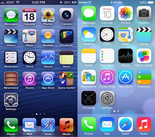
In recent years, the influence of minimalism in design has only increased since Microsoft, Apple and Google started using ‘flat design’ for their respective operating systems. In flat design, elements are portrayed as 2D illustrations rather than resembling real-life objects, which used to be the case in skeuomorphic design.
A comparison between skeuomorphic and flat design. Source
By using simple shapes and no 3D effects, flat design offers consistent and visually aesthetic styling. Flat design is not minimalism, but it is one of the design trends that supports the concept. It gives us the feel of minimalism in an application, but no matter how minimal the interface looks, it will not be enough if the content is needlessly large. So, the concept of minimalism in this blog is not simply used as a styling guideline. It is more about utilising advancements in technology and design to make learning easier.
So what can minimalism offer to learning?
Processing Power
The human memory is responsible for processing data in every interaction we face in the real world. There are two types of memory: working memory and long-term memory. The working memory can be thought of as a temporary workspace allowing us to manipulate information while carrying out tasks such as reading.
Information from our working memories can potentially be transferred to our long-term memories. But, it’s estimated that on average a person can only keep 7 (plus or minus 2) items in their working memory. Cognitive overload happens when working memory receives an excessive amount of information. This interferes with the learning process because the working memory cannot process all this data.
Reducing the amount of data to keep only the important information is one of the key aspects of minimalism. So minimal approaches in design can help reduce the cognitive load of learners. The chance of getting distracted is much lower when the screen is not bloated with irrelevant data. Decluttering the content allows a learner to capture only the essential information.
Speed and screen responsiveness are other benefits of minimal design. Having less information gives us faster loading time while also making it easier to optimise the content in different screens.
Cutting down to business
So how do we apply the principles of minimalism to digital learning? The first thing to do is eliminate any kind of text with no purpose. Start being minimal at the beginning of the creative design as cutting things out later can be quite daunting and take longer.
Try and keep learning points concise and focus on microinteractions to make them understandable in a short space of time. Although, this may not sound challenging, simplifying the content for a learning environment is quite difficult. Removing content just for the sake of minimalism can make it insufficient for learners to fully grasp the learning point. So, like most things, there’s a fine balance.
There are a few other methods which can help to simplify content without obstructing the learning process…
Whitespace
This solution is indirectly involved with simplifying content. Whitespace refers to the space between or around elements. It does not have to be white or a background, it just is an empty space. Apart from giving the design a more structured look, whitespace enables a user to maintain focus while reading. There should always be a reasonable amount of whitespace between paragraphs, lines and letters. Furthermore, responsive styling should auto-optimise itself in most cases for devices with a small screen.
Break it down
Breaking down the content into pieces allows learners to take a breath and to reflect on what they’ve just read. There’s nothing more off-putting than a wall of words. These pieces can appear in an organised manner on the same page or even on different pages. This also assists in creating an effective narrative.
Meaningful animations
An interactive experience requires a mixture of impactful storytelling and animation, as well as intelligent interaction design. A subtle infographic-style animation instead of text to explain a difficult concept can be much more effective and aesthetically pleasing.
In addition, animations go very well with progress indicators. Having a progress bar or small milestones give learners a sense of accomplishment and let them how much more content to expect. A carousel with progress dots, for example, breaks out the content, saves space and sets up a story.
Minimalist alternatives for text
Content does not have to be limited to text only. Use of images is a well-known way to say more with less, but audio and video can assist further in expressing your learning points. However, make sure the production value or curation of these images is to a high standard or they may just end up being a distraction.
Minimalism, in the end, is a simple idea; but quite difficult to execute. Nevertheless, the advantages it provides for digital learning can’t be understated. As well as easing cognition and delighting the learner in elegance, it drives home the most important learning points. And if the delight element then makes this go from working memory to long term memory then the value of the learning means that behaviour change is likely to have occurred.
Although it can be difficult to find the right mix between what elements to eliminate or keep without compromising the content, when you strike the right balance, your learners will fulfil their objectives with ease!


