
There’s a lot that happens behind the scenes when designers begin to conceptualise a new project. But what they’re doing and the thinking behind each element has more bearing on both the user experience and the actual learning, than you might first think.
How do you decide whether you’re going to select a four-column grid or an eight-column, to design an application or a webpage? Where are you going to put images, text or embed videos? How do you choose between a horizontal or vertical scrollable item? How many buttons are too many in your navigation bar?
Before the designer even thinks about putting pen to paper, using design-based thinking, we can ensure we know the why of the learning layout before we even get to the how. If the learning design is not intuitive and tailored to the user’s needs, it will be received or used poorly and will ultimately put off learners from consuming the content – however good it might be.
Tell me more…
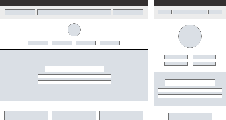
Wireframing is a vital element of the UI design process and forms one of the 5 key steps of design thinking; prototyping. Basically, wireframes are black and white templates that define the size and arrangement of UI elements on a screen. In order to keep the focus on the structure; wireframes have no colours, fonts, logos, or any other design elements.
They’re generally used early in the development process to help establish the basic structure of a webpage or application, before beginning the visual design. Usability.gov breaks it down as, “a two-dimensional illustration of a page’s interface that specifically focuses on space allocation and prioritization of content, functionalities available, and intended behaviours.”
But to put it simply, it’s a skeletal framework for a webpage. A layout that lets you depict what elements will eventually exist on that particular page or screen.
Why do they matter?
Wireframes can help you gather your ideas and functional requirements together, allowing you to see the full picture – as well as saving time. It’s easier to make composition changes at the wireframe stage rather than during the creation of the final mock-ups, when you’re likely to have lots of visual elements in play.
The main aim is to provide a visual understanding of a page early in a project, allowing you to get stakeholder and project team approval before the creative phase gets under way. Wireframes can also be used to create the global and secondary navigation to ensure the terminology and structure used for the site meets user expectations.
“A wireframe is like a blueprint in the design process that should not be skipped, just as you wouldn’t build a house without a blueprint.”1
But what effect will using a wireframe have on learners?
By utilising wireframes during the prototype stage of design-based thinking, not only will you save time and resources throughout – you’ll also be able to test whether your instructional design and learner journey helps to motivate a learner through the experience, making it frictionless.
Highlighting any major flaws this early in the development process ensures learner needs are at the forefront of everyone’s minds and makes the whole project dedicated to change – in the smallest detail. This is what a true bespoke design entails if changes to behaviour and measurable learning outcomes are to be achieved.
Design-based thinking is essential when developing learning, check out our three part series that delves into why it isn’t ‘bulls**t’. The wireframing stage generally comes once the research phase is complete, and our project team have collected sufficient information about the user’s goals and motivations.
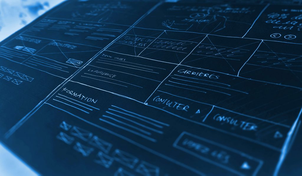
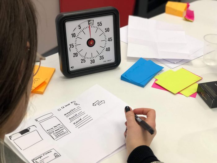
Saffron designers and developers often find that doodling whilst doing research and feeding that back to users, can help to truly understand the ‘why’ behind the functionality and flow of the page. There isn’t a hard and fast rule or fixed sequence for wireframes, but quick, low-fidelity doodles help during the early ideation stages of a project.
We often keep it simple with pen and paper drawings. Besides from being quick they can be equally as effective as digital wireframes. Rough sketches can communicate and solidify ideas, as fast as you have them. Accessible and simple, wireframes aren’t ring-fenced for designers.
But, there are also a wide range of tools and apps that make wireframing quick and easy. Balsamiq, Invison, MarvelApp, Axure, the list goes on – just find one that suits you.
Two major types of wireframes:
-
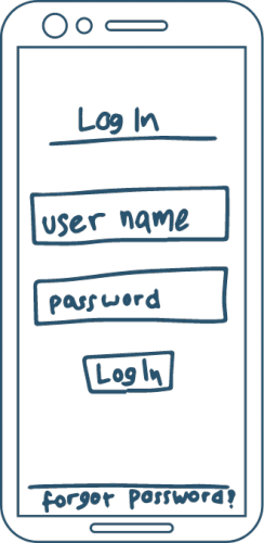
Low-Fidelity Wireframes
Generally, low-fidelity wireframes are black and white sketches drawn on a piece of paper. Elements of user interface are represented as squares and lines without any detail. These wireframes can help to portray an idea to developers about the general concept.
-
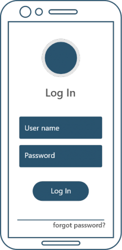
High-Fidelity Wireframes
High-fidelity wireframes are created using design tools or software. The main difference is that these wireframes basically look like a ready-made product with other supported elements. They can look pixel-perfect and much closer to how they would appear in the final version of the software. They’re still monochrome but utilise shading and dimensions to create elements.
How does it actually help?
First and foremost, wireframes make design changes more efficient. When designers are creating your learning’s UI design, they’re likely to spend hours agonising over each element. But you may not appreciate all this, so be open to seeing a concept rather than the full design!
At Saffron, when we start the process with wireframes, both internally and with clients, design changes can be reworked in a matter of minutes. Rather than wasting time and resources to create initial full-blown, high-fidelity designs clients and development team members can rework and approve designs, without fear of the time and cost involved in addressing design issues and clients feel actively involved in the ideation process.
What about design navigation?
One of the most important aspects in web or application design and development, is navigation. But it can be tricky for clients, designers, and even developers to evaluate navigation until they actually have an opportunity to use it.
Wireframes allow people the opportunity to test run; to see how easy or difficult it is to locate key pages; to determine whether dropdown menus clarify or confuse the user; to find out whether breadcrumbs are useful or distracting. And also importantly to address any accessibility issues.
Wireframes allow us to intuitively construct design templates, as well as:
1. Test and refine navigation
2. See the content lay out
3. Study and rapidly adjust the user interface design of web forms and interactive elements
4. Evaluate overall effectiveness of the page layout against usability best practices
5. Determine web development and programming requirements
6. Create design friendly content
In the end…
Wireframing is a key part of our design process and underlines our design-based thinking principles. Involving learner feedback and stakeholder throughout the process ensures that the learning will be a good experience and will help in embedding concepts, so that change can happen.
If you want to chat about how we can design an experience for your learners, get in touch! We’d love to talk.